
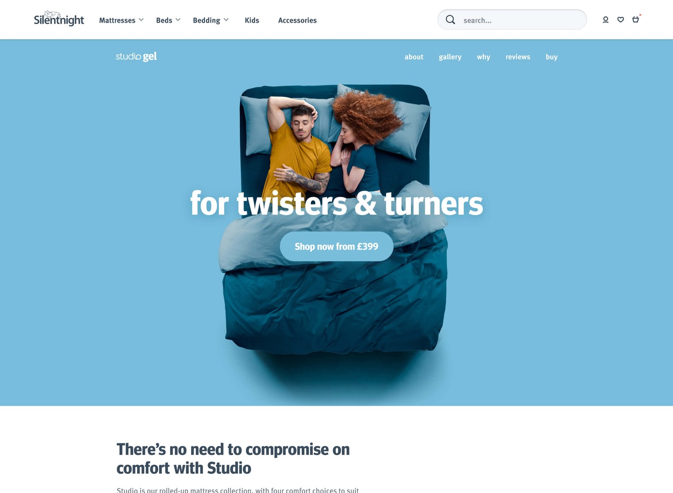
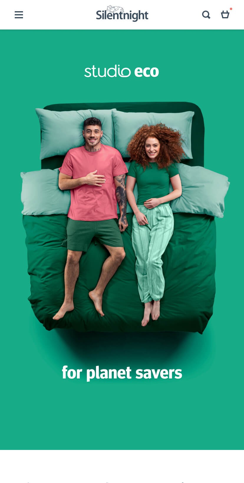
Convenience with an element of customisability
The Studio collection is a range of rolled mattresses with next day delivery. What makes this collection unique is the ability choose a comfort layer. The mattress also has a spring layer, which few rolled mattresses have. These features—when translated into benefits—combined with ease of delivery give clear reasons to buy.


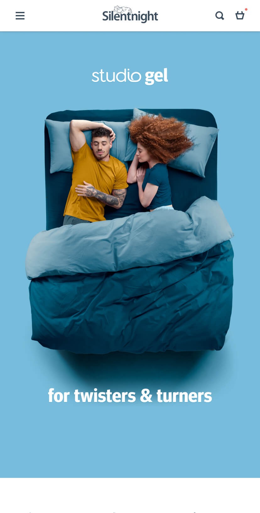
Creating themes for each mattress
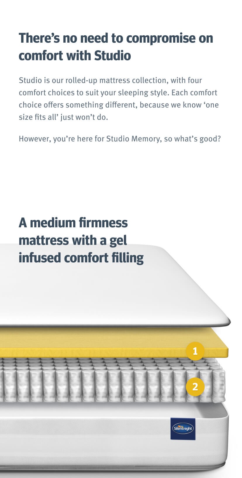
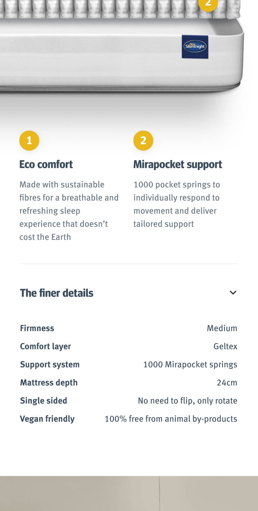
Each mattress within the collection has a different comfort layer (a layer which sits above the support system that you can tailor to your individual sleeping habits) and differing name and colour scheme associated with it.
I used this as a basis for theming the pages and tying the sub-brand together. This helps customers differentiate these mattresses, as they are white rectangles in a literal sense.
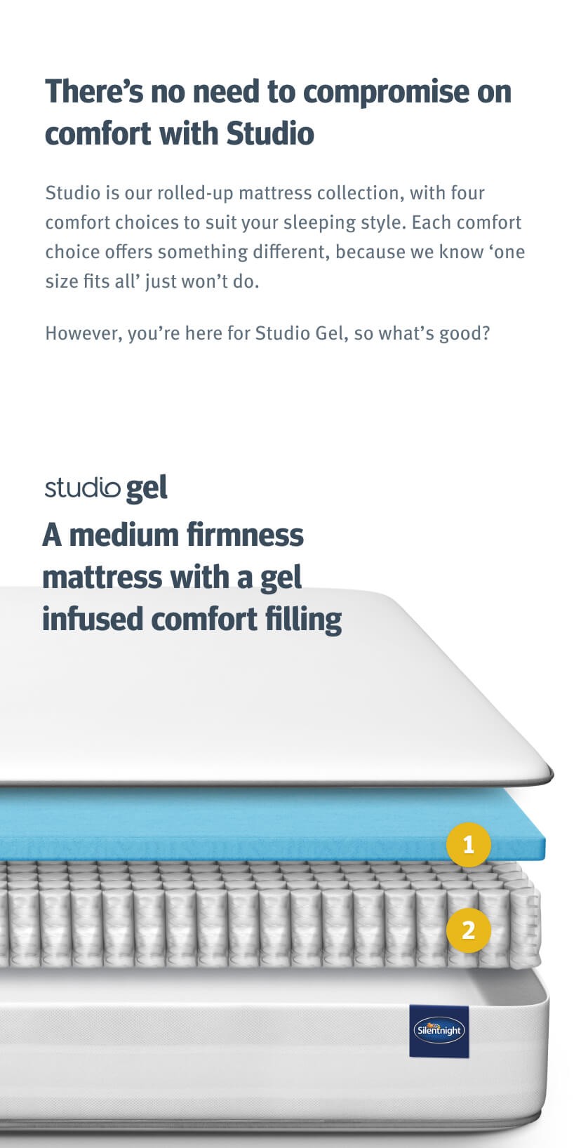
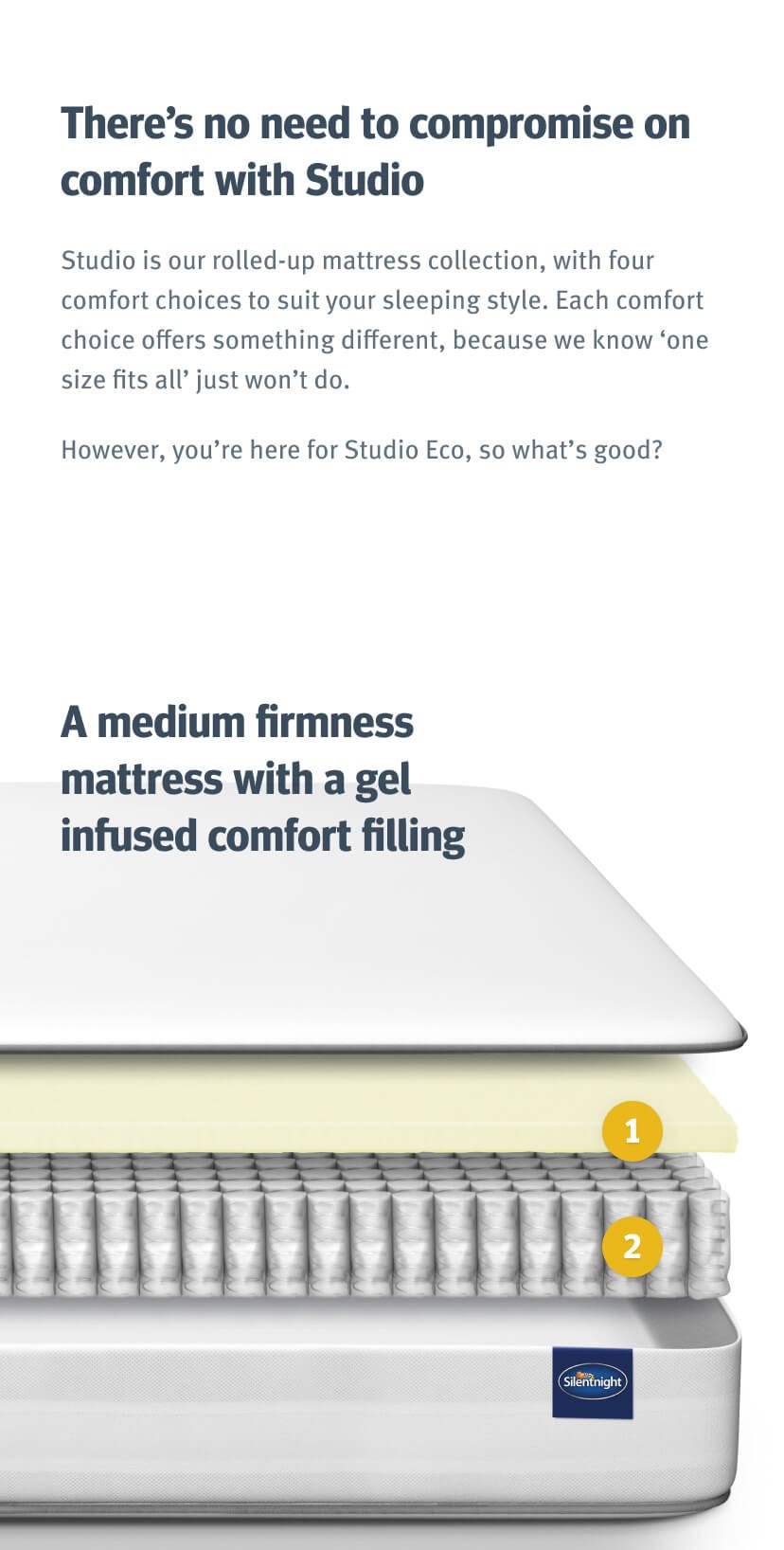
Translating features into benefits
These features create a challenge for customers to understand which to buy. So through a combination of bold typography to help with scanning and ways to expand content further gives that understanding.

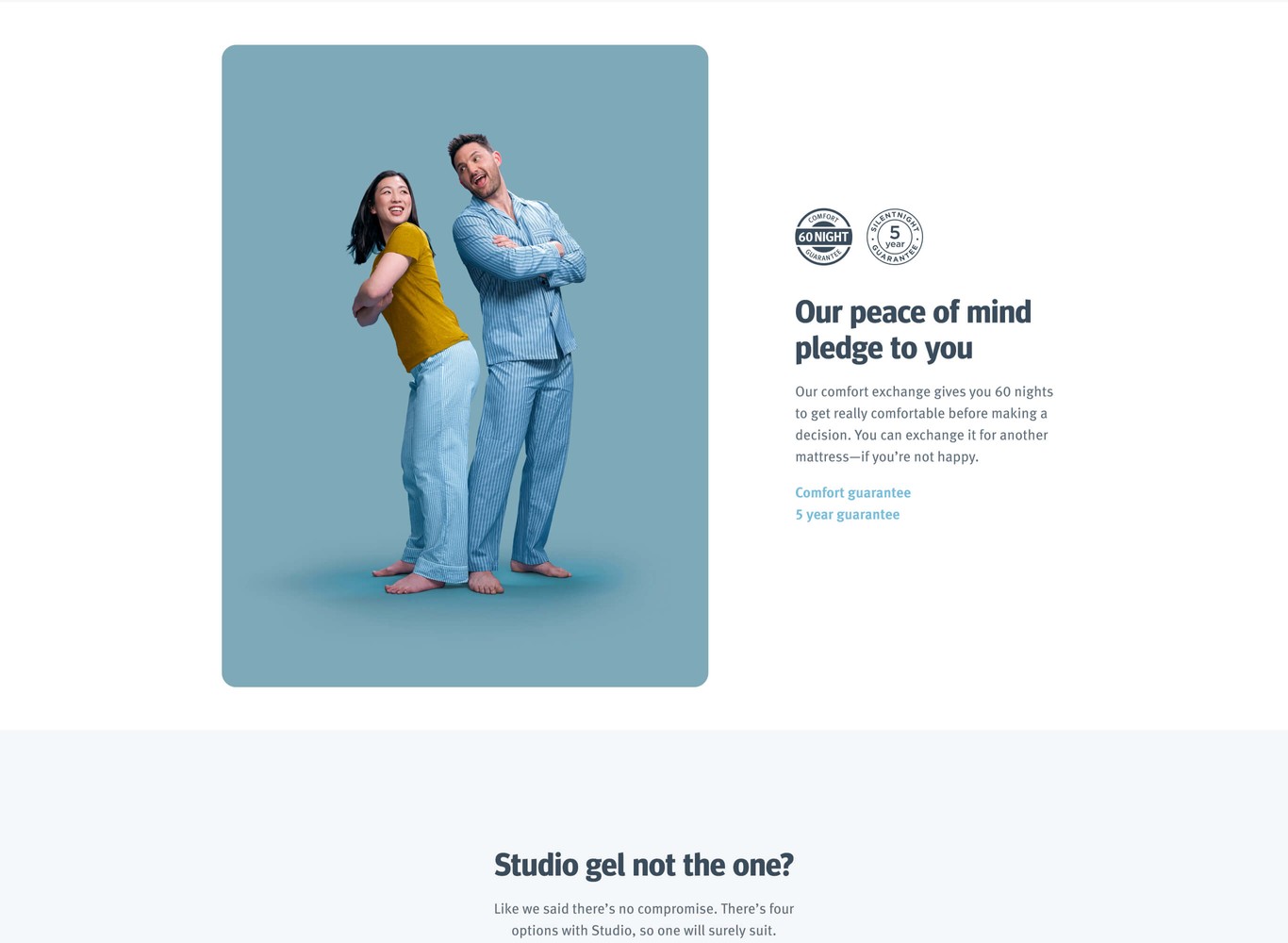
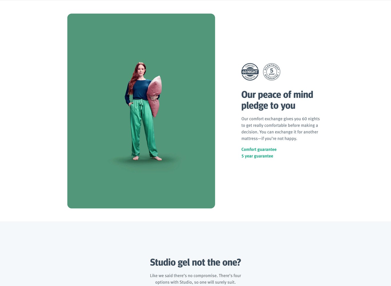
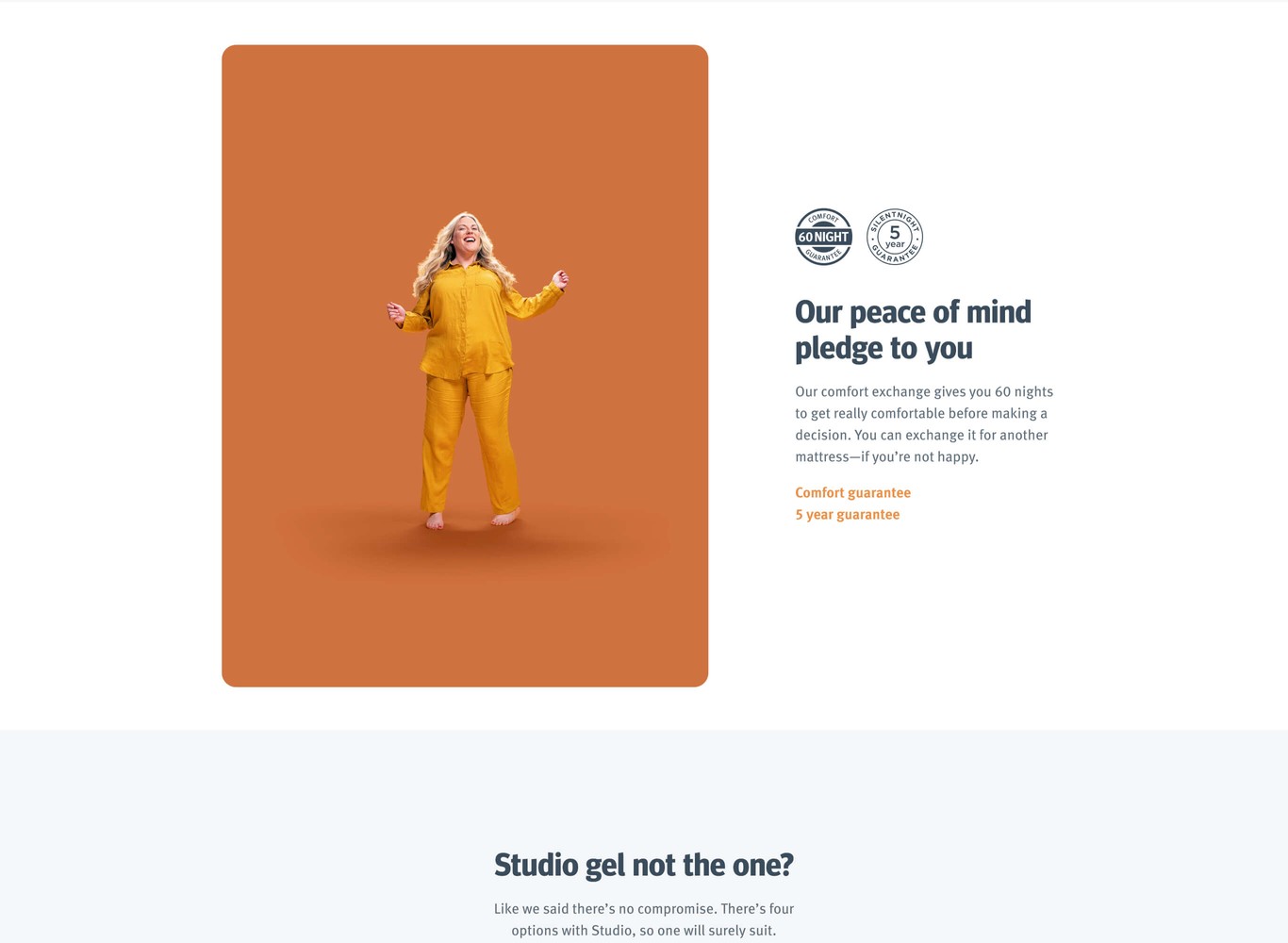
Guarantees to tie it all together
For me the photography was an easy to work with design element. No matter which section I was able to keep the colour theme running throughout. And with something like guarantees it brings more life to it.