Understanding the readers
It’s important to understand the frame of mind people are in whilst looking for solutions in articles. So throughout the process I wanted to keep this in mind.
Time is the main factor
There are two main types of people who visit this website. Those who are currently working and those who are learning.
The distinction between the two is the time they have. The person working wants a quick solution and the person learning wants to be guided and understand much of the why.
I’m working
I’m currently working on a project and in a hurry to find a solution to the problem. I want to skim the article, grab the solution and get back to what I’m doing.
- When I’m stuck I want to find the solution quickly within the article.
- I want to trust when I copy code or values it’s the complete solution.
- When I’m using a tool in an application, I want to know where it is without having to spend time hunting for it.
I’m learning
I’ve heard of this particular topic, I’d like to research and learn more about the topic. I’ll search for tutorials on this topic.
- When I’m trying to improve my skills, I want to understand a topic fully, so I can recall it easier when I’m working.
- When I’m trying to improve my skills, I want to know why something is done this way, so I can form my own opinions.
- When I’m using a new tool I want to know where it is, not only the keyboard shortcut.
Understanding the workflow
There was a reasonable amount of articles on the website—which means a workflow is in place. I wanted to see where I could make the design of articles better without increasing workload.
With the majority of articles being tutorial based and few being the occasional essay, you don’t want to make things take longer. Consistent publishing is about having the least amount of friction in the way of hitting publish.
Improve the design and aim to increase efficiency
Each post has various assets associated with it. From application images, code samples, keyboard shortcuts and references to name a few things.
These things take time to gather and produce on top of an article alone. These extra details are aren’t necessary but improve understanding and engagement.
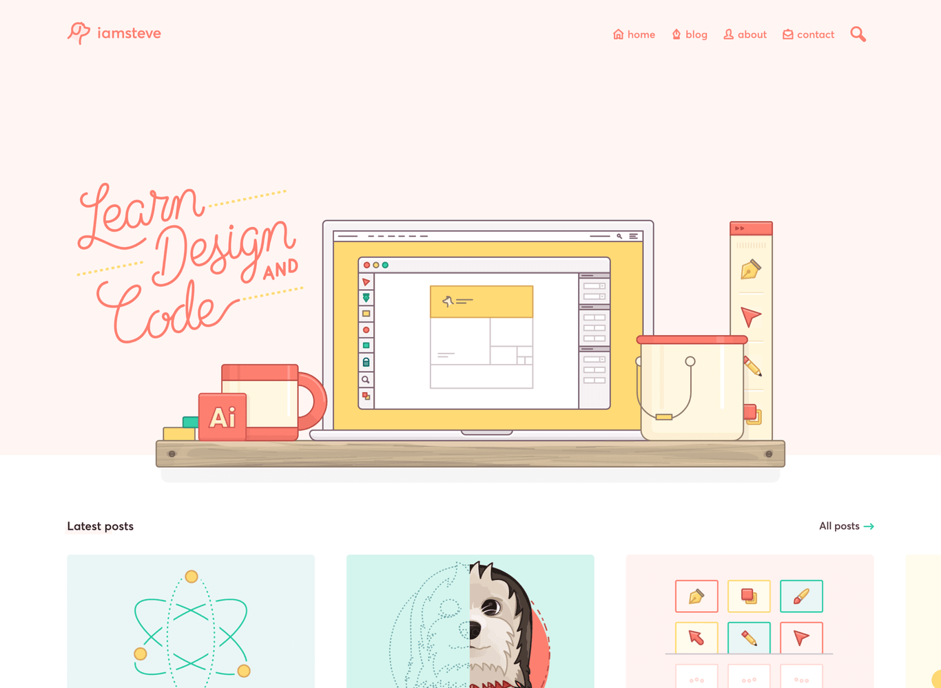
Flexible colour palette
Starting out, laying the foundations for producing content and addressing the primary goal is the colour palette.
It’s necessary for illustration
Whilst few colours would be used throughout the design. I wanted to give variety in hues, tints and shades so that featured images and illustrations had enough freedom. The challenge is in keeping things complementary.

Custom pixel perfect icons
With the illustrations throughout the website having particular stylistic choices (eg: stroke weight) it made sense that the icons were consistent with that.
All illustrations are drawn with 2px rounded strokes, this was the main constraint to adhere to. Each icon is drawn on a 16px grid, being implemented in a way the colour can be adjusted in code.
 Scaled for dramatisation
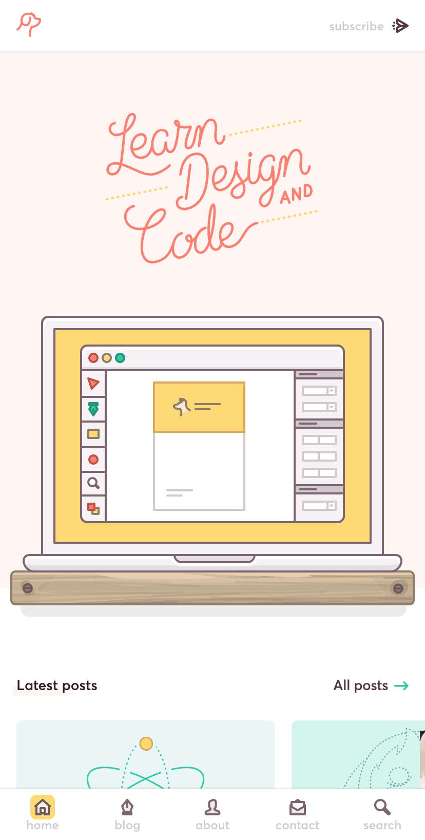
Bold and clear typography
For the design of articles, people reading or scanning articles will benefit from a clear visual hierarchy and lack of distractions. Along with generous spacing to help create areas for the eyes to find a break.
Headings are treated like a table of contents—in effect—denoting a new chapter. You can also click the icon next to these headings to grab a link to them.
It doesn’t stop at design
Design defines a lot of the harmony found within articles, but it goes beyond typography and spacing. It’s up to the creation of content to maintain that experience.
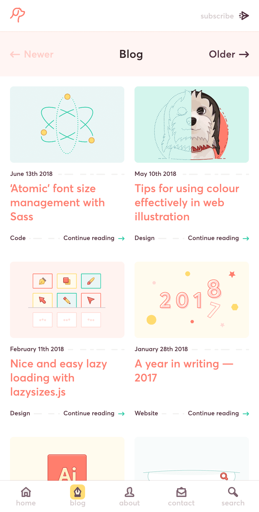
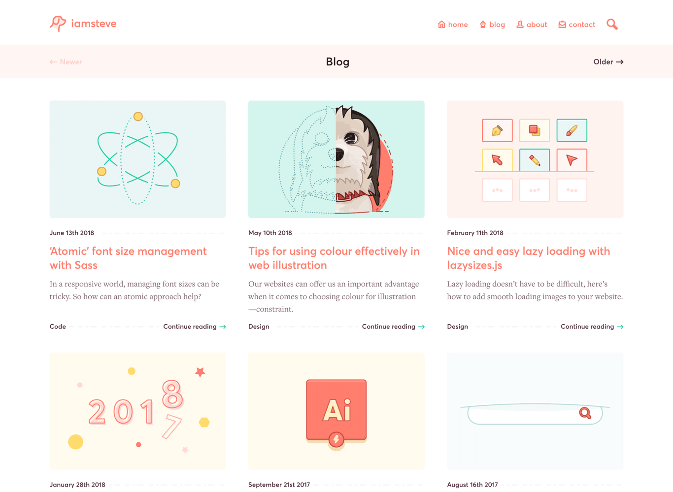
I defined ways to create a more unified feel between list pages & articles themselves efficiently.
- Use the same sizing for featured & in article images
- Even if the image could feasibly take up less space
- Use light shades of the colour palette for featured image backgrounds
- Aim to use one or two distinct colours within featured images
- Set up templates to save having to refer to image sizes & colour
Some of these things appear simple, but it was a challenge to define appropriate sizing for each element. So that it remained in harmony throughout the design.
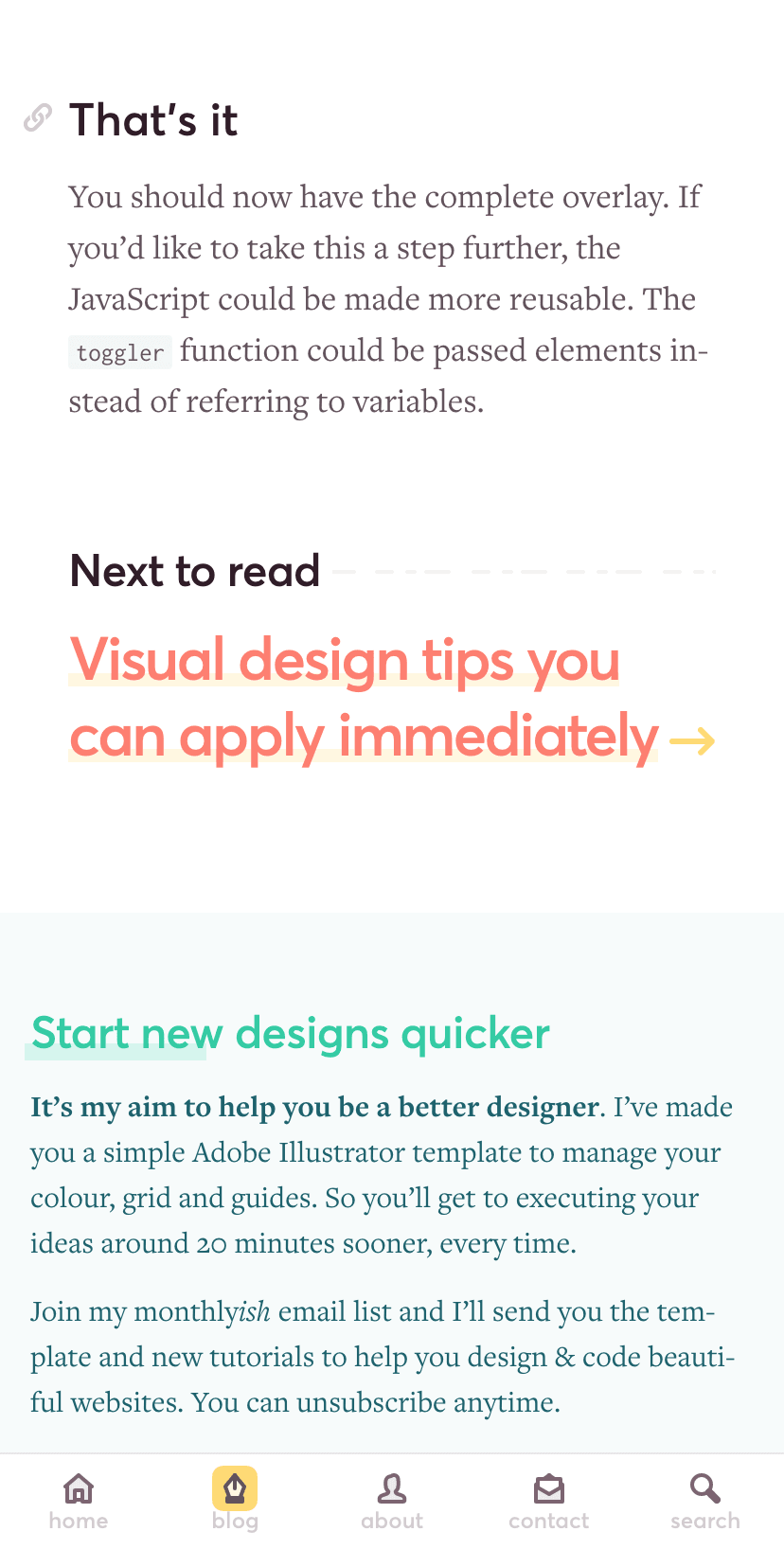
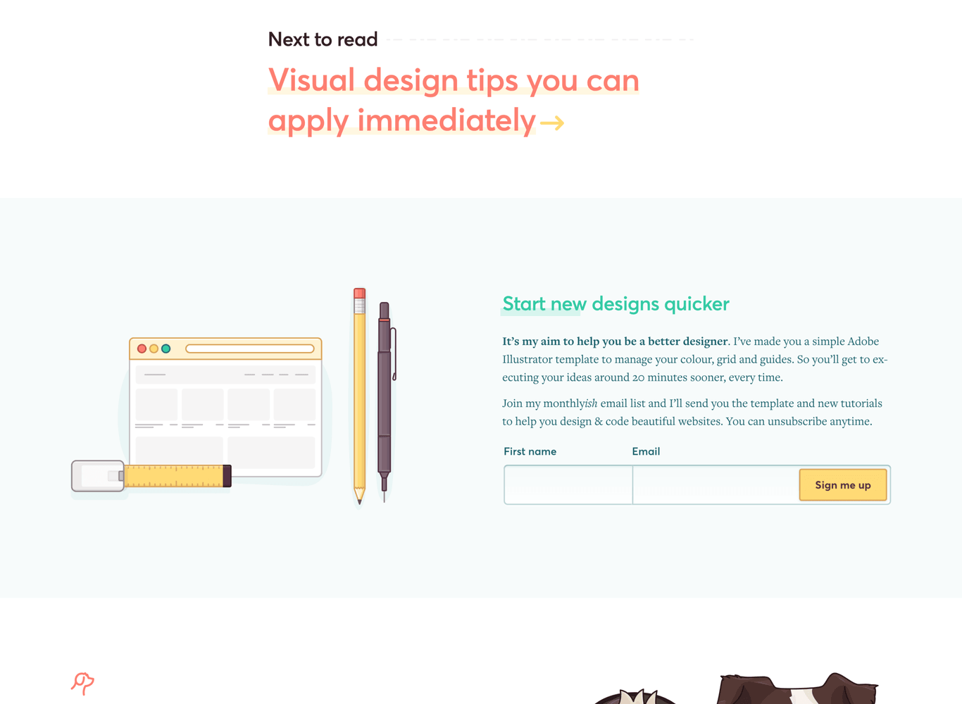
Results
The design wasn’t just a massive visual improvement, it was a restructuring and refocusing of a website that balanced two competing goals. Focusing on the writing side of the website saw the following:
Newsletter growth
The newsletter grew from 0 to 587 subscribers within a year
Visits increased
Traffic trebled year on year every month for at least a year
Site speed improved
Making use of modern techniques for loading acheives ~3s on 3G load times.
More pages viewed
Visitors viewed more pages per session increasing from 1.4 to 2
Features
- The website was saw a few submissions to user generated galleries like Site Inspire, HeaderLove and Best Website Gallery
- Article featured in CSS News
- Article featured in HeyDesigner
- Articles featured on Awwwards, 1 and 2