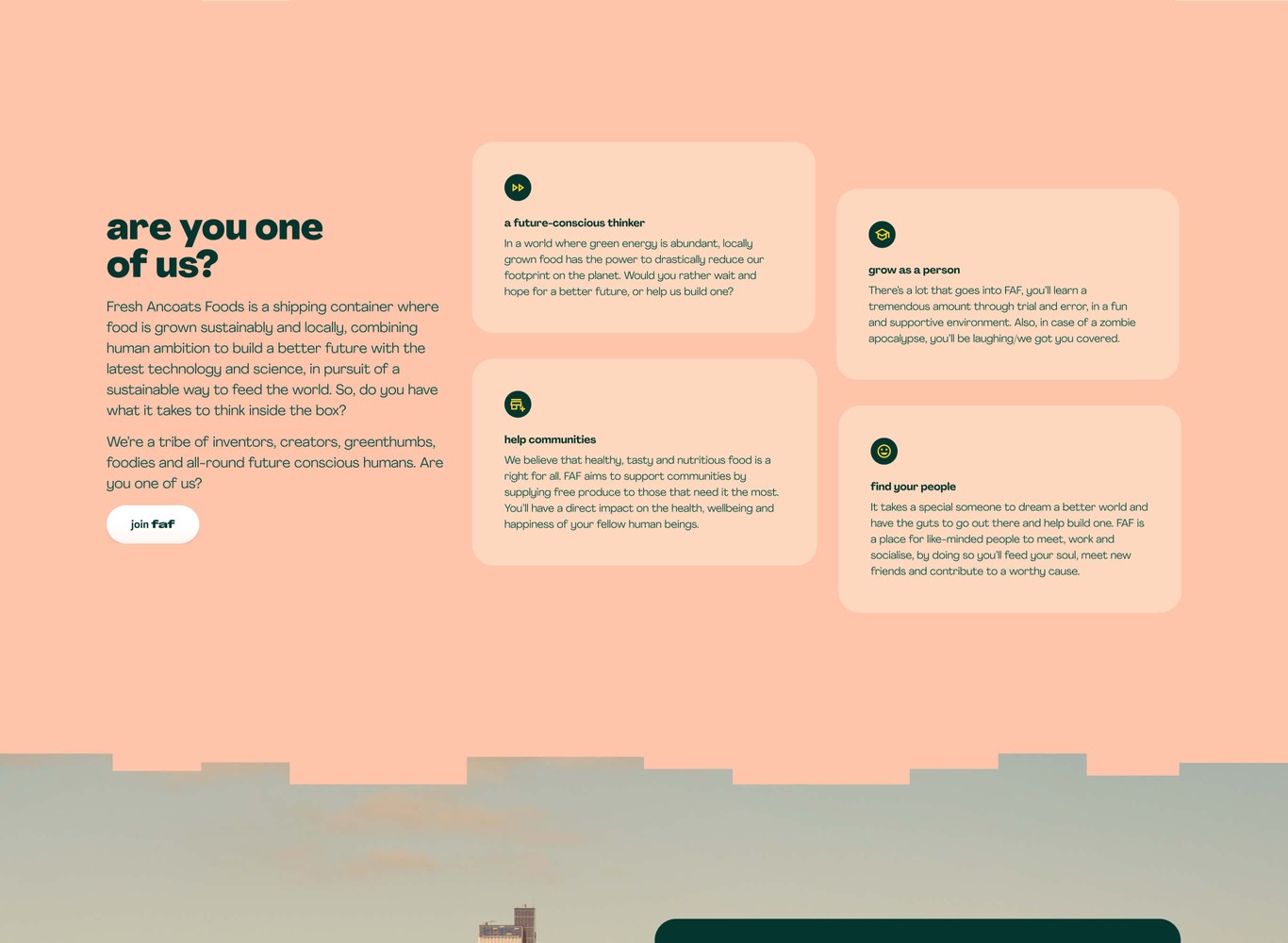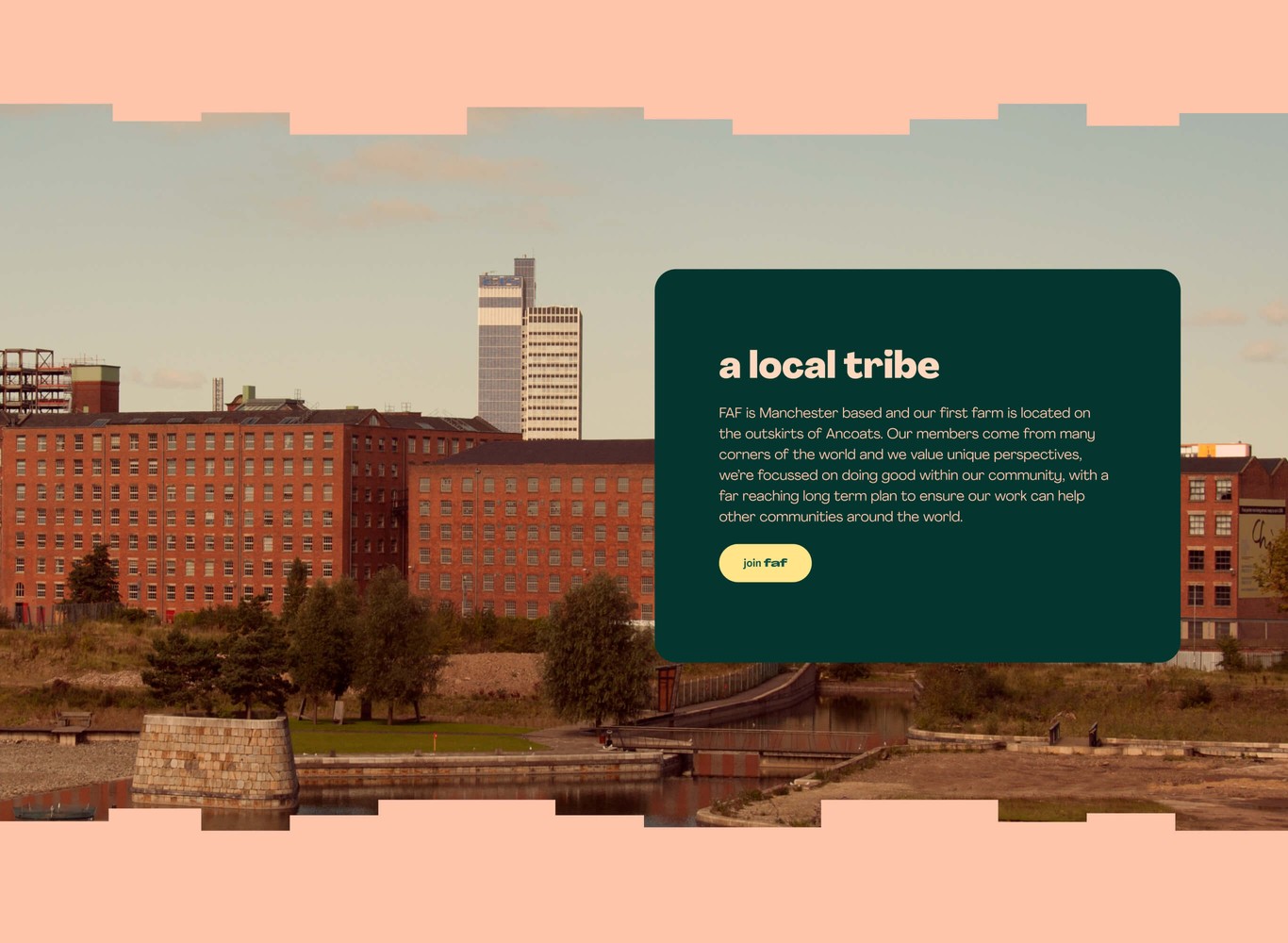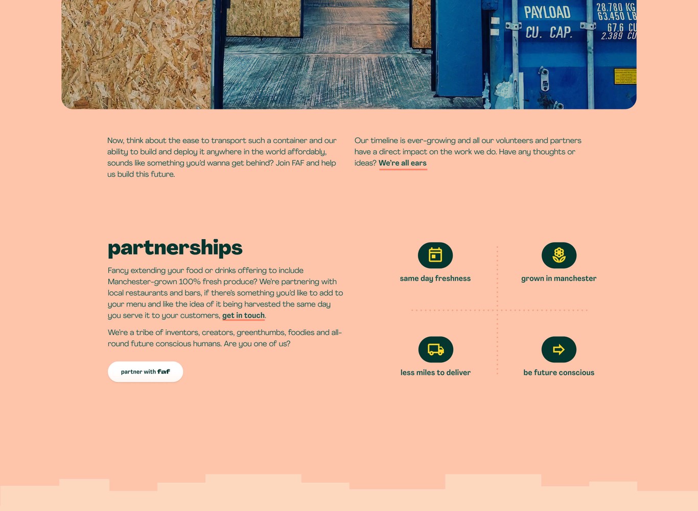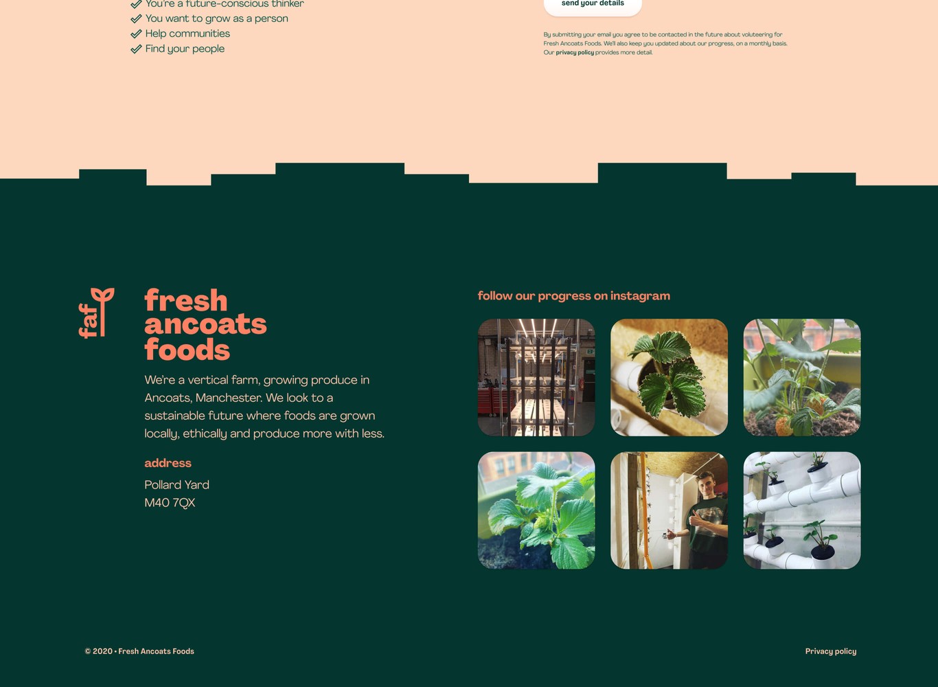

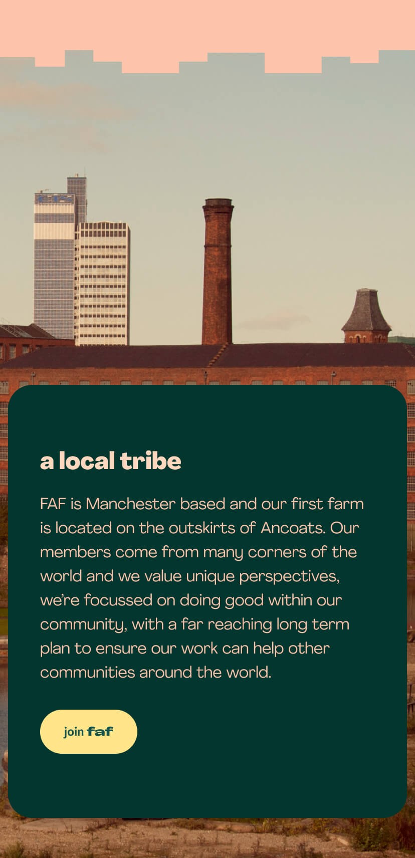
A fresh design with elements of the city
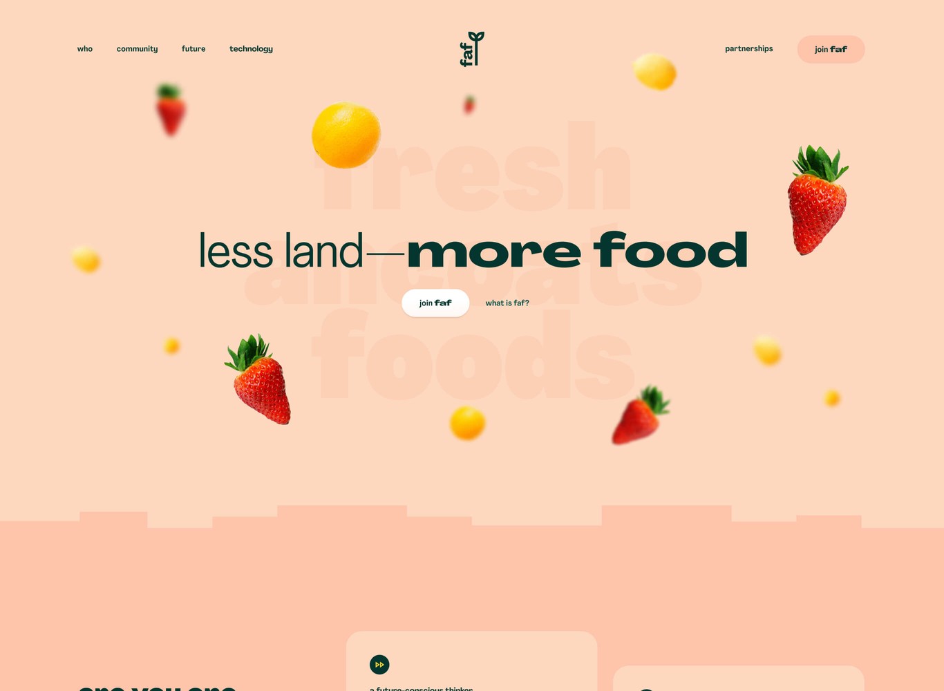
Working with FAF we created an outline to promote joining the community, along with an element of growing partnerships for produce. Community will be an integral aspect of their success, so, it makes sense to begin with this focus.
The design works to highlight the benefits, with a fresh look and feel. Throughout the sections of the page are broken up by edges that are inspired by the ever evolving Manchester skyline. It encourages you to scroll through the page and works with the local element FAF want to communicate.
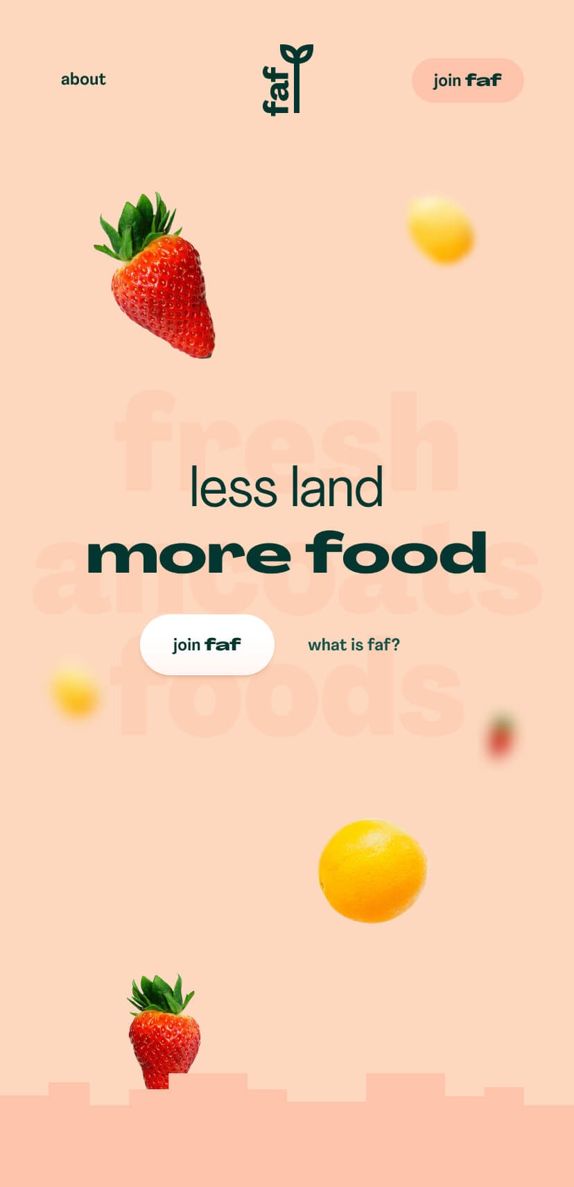
Using type and flying fruit to show benefits of vertical farming
A benefit of vertical farming being less land and more food was a fun angle to lean upon. Using narrower and extended type to display this tagline along with the falling fruit to communicate abundance.