Designing a system for page creation
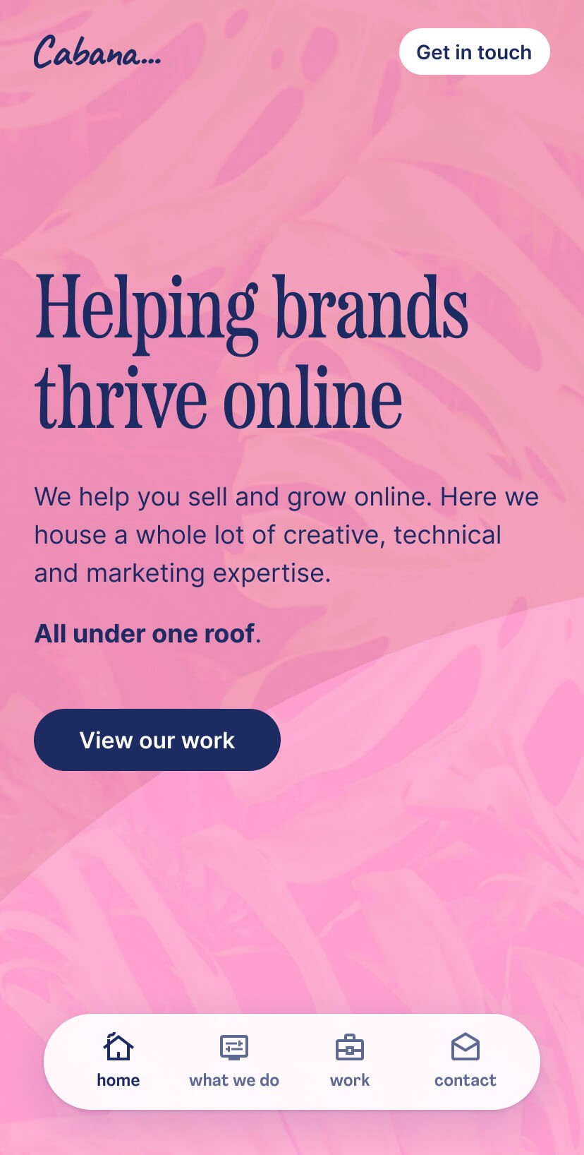
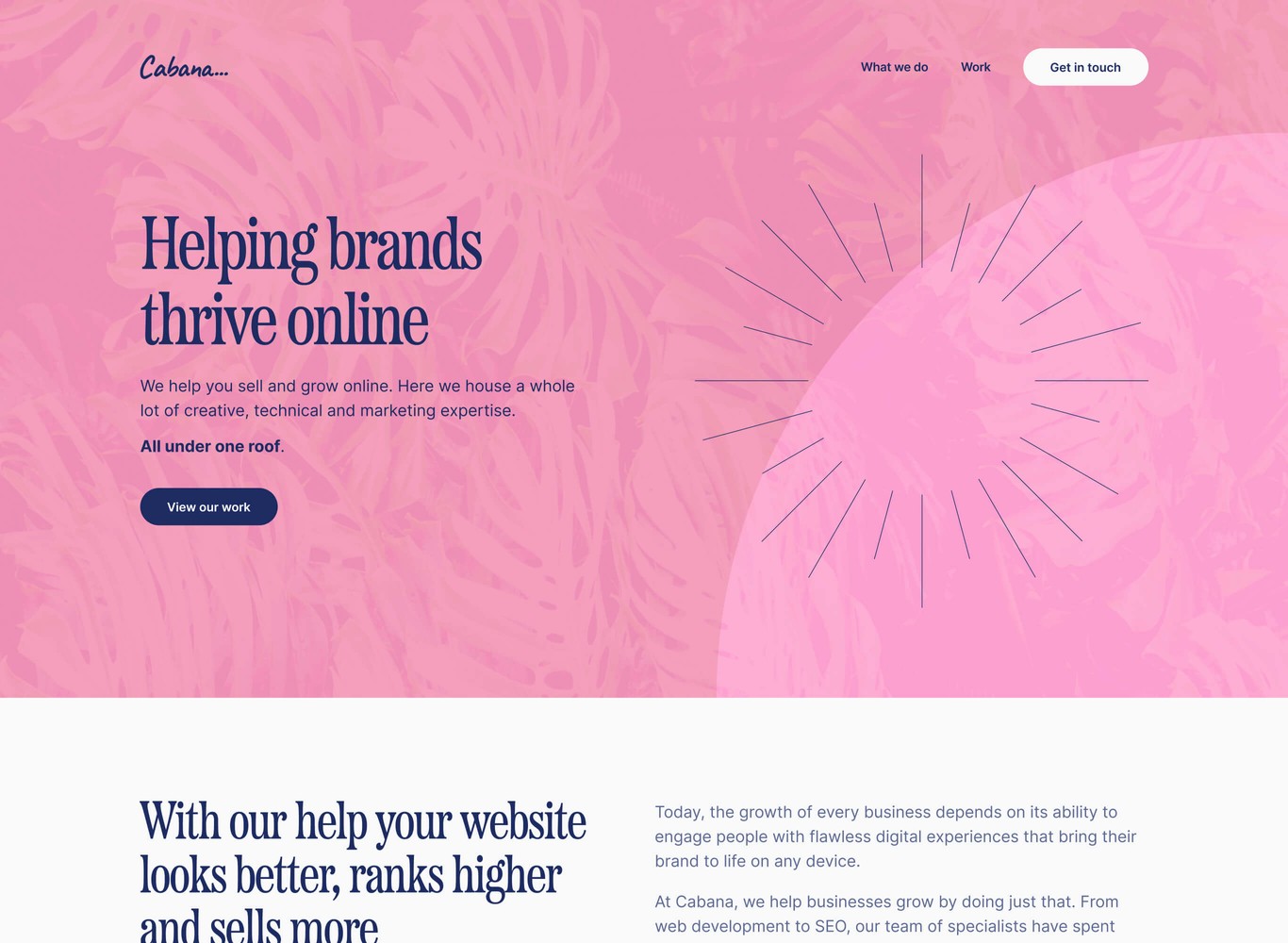
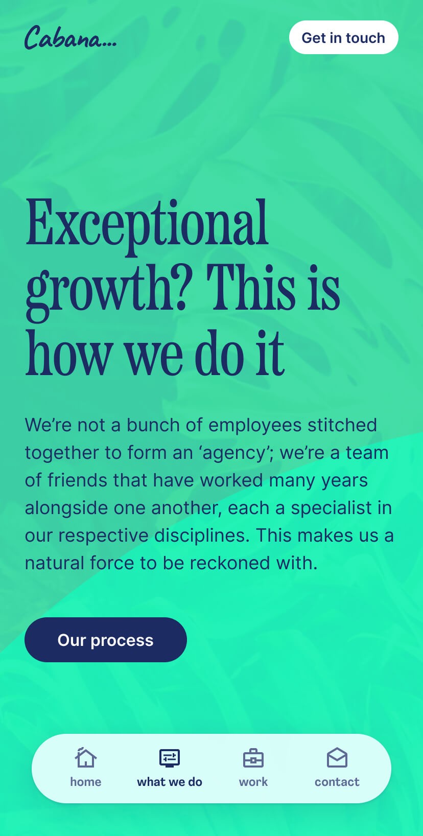
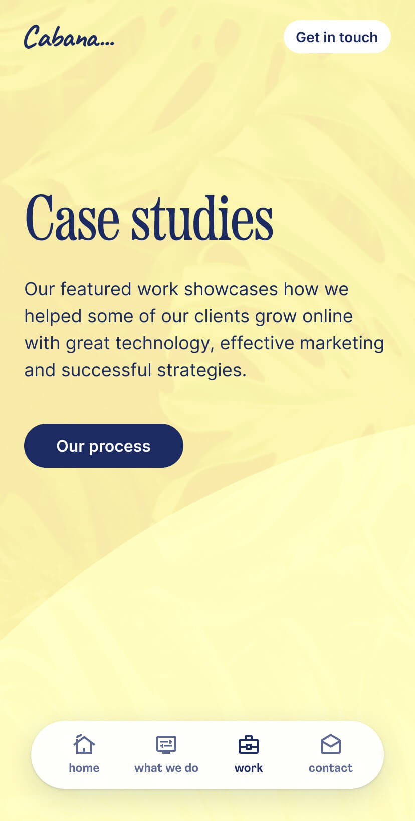
With Cabana, I worked to get the structure and flexibility required with the design. Being able to have a range of colours to keep things fresh between pages. It also helps to convey the tropical and growth aspect of the brand.
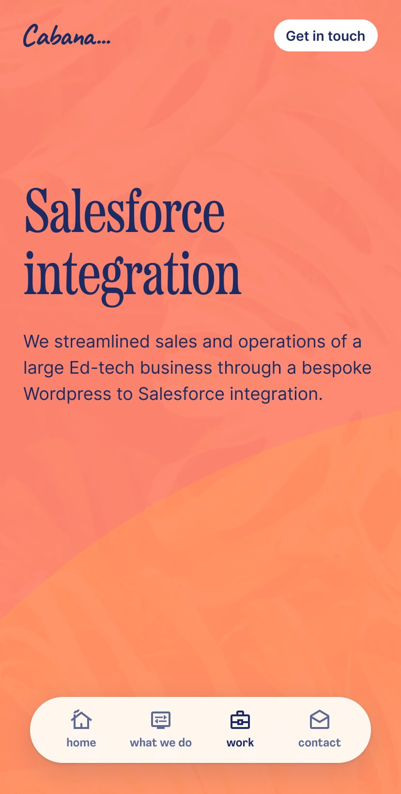
Mobile
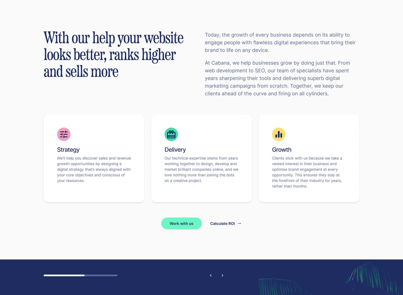
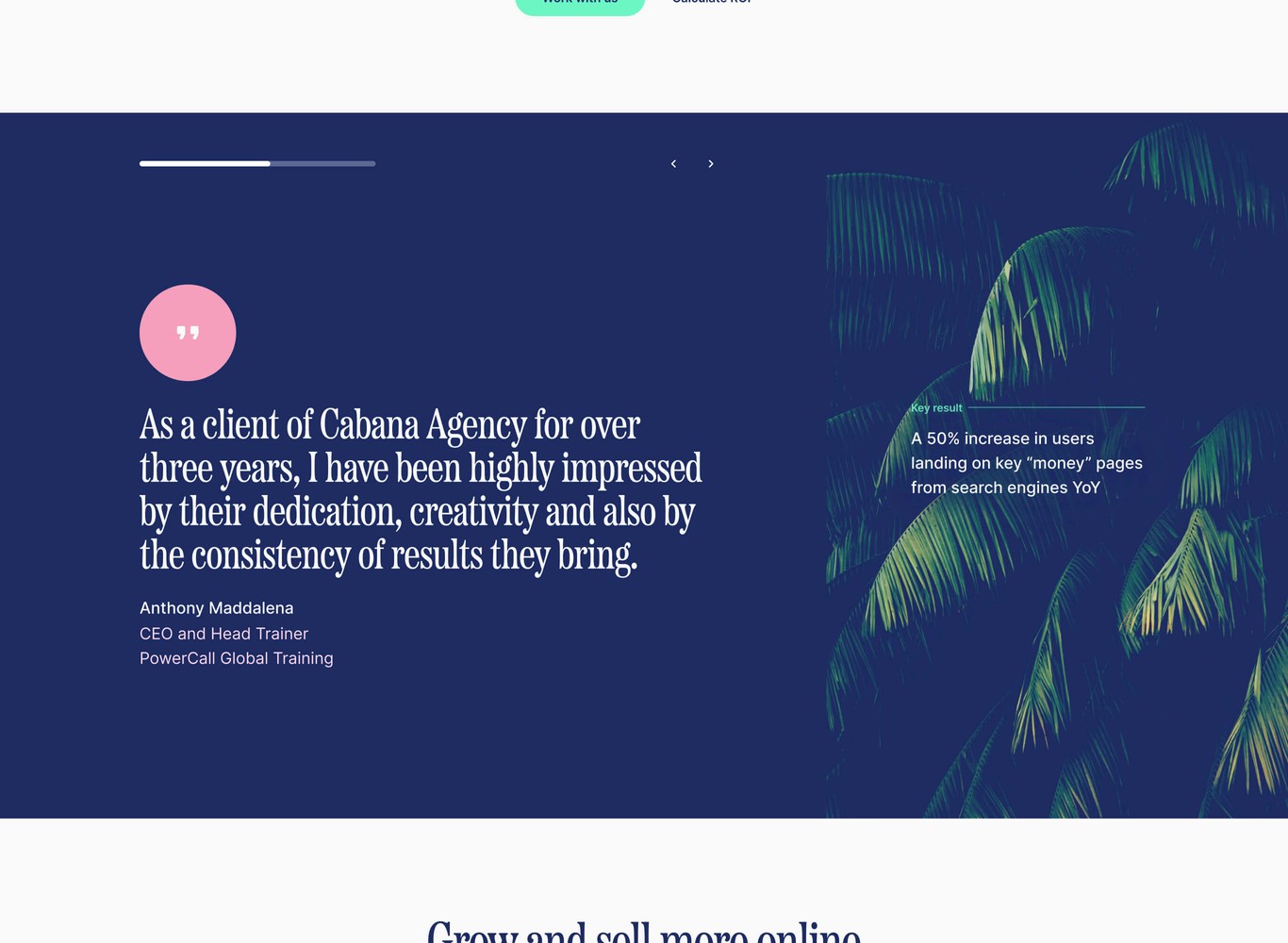
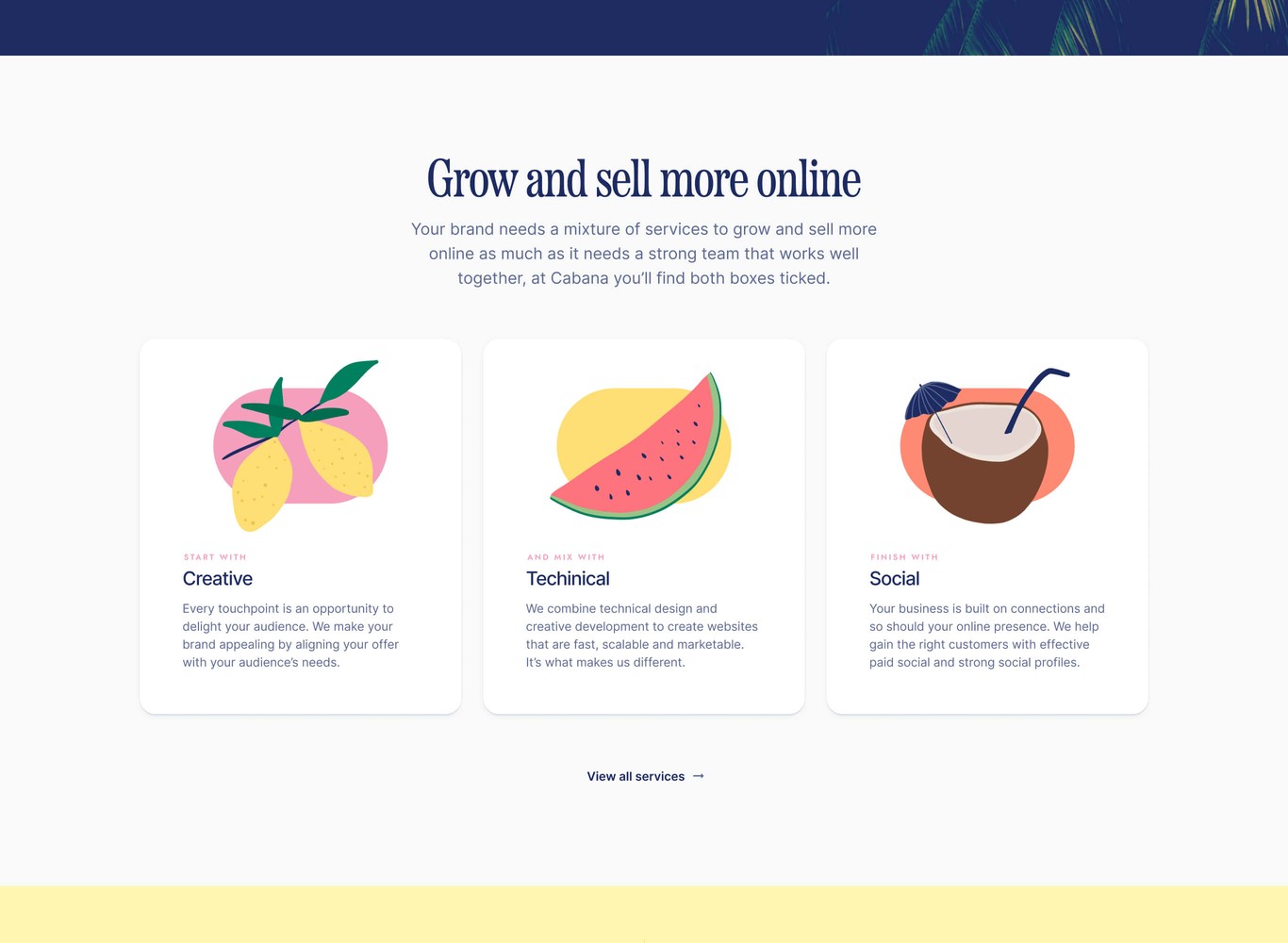
Desktop
Tidying up brand elements
As I was working around the design and colour I found the logo was bugging me. I felt the type choice represented Cabana well but it needed kerning improvements.
Starting with improving the logo
As an agency, it’s important to show your attention to detail. The Cabana logo was using a typeface without modification, I made a few quick adjustments to make it feel that bit more intentional.
If you look closely at the before, taking in to consideration the three ‘a’ characters, there’s an almost awkward space either side of them. So generally tightening up the kerning here adds a better balance to the type overall.
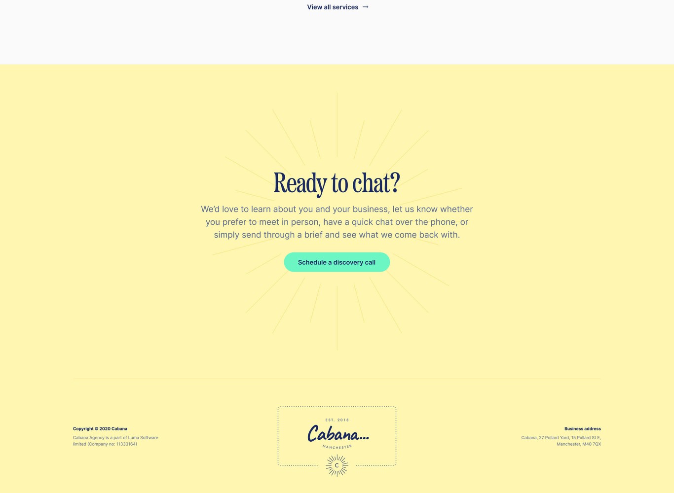
Colour and type really set the tone
Cabana were open to me exploring ways to refresh their brand. I set the tone through defining colour and type. From discussions, it led me to inspiration from the 80s vaporwave style and labels from bottles of mezcal.

Add more vibrancy and warmth
Noting the cooler blues and more muted greens that were present throughout the site, I saw no need to veer too far.
In my opinion, they were close to hitting the tropical vibe, but it needed more warmth, which I brought in through pink and working on the blues and vibrancy in the greens. Adding a few other complementary colours to that, you achieve what Cabana were looking for.
Visual flourishes
As mentioned with the mezcal labels, I figured I had to try bring that style in somehow.
As I created the label and it felt right to round off the website with it.