Context
At the time there were around 12–16 guides, with varying amounts of depth in the information. Some were accessible through the buying guide, some required a different journey to access. Some had a stronger emphasis on marketing or technical jargon than others.
Confusion around terminology is something as a team we saw frequently throughout usability sessions with customers.
With Silentnight’s vast product range, it was impractical at the time to do a major overhaul of product and category pages to try address this directly. This was an important reason to target improving the guides.
Customers could access guides from relevant navigation, categories and product display pages themselves.
How should things be structured?
I worked with the content lead at the time to understand the content and structure we should aim for.
With a minimum of 80% of visits per guide through search we were able to find where to combine guides, keep links and improve the overall flow of guides.
A slightly changed perspective…
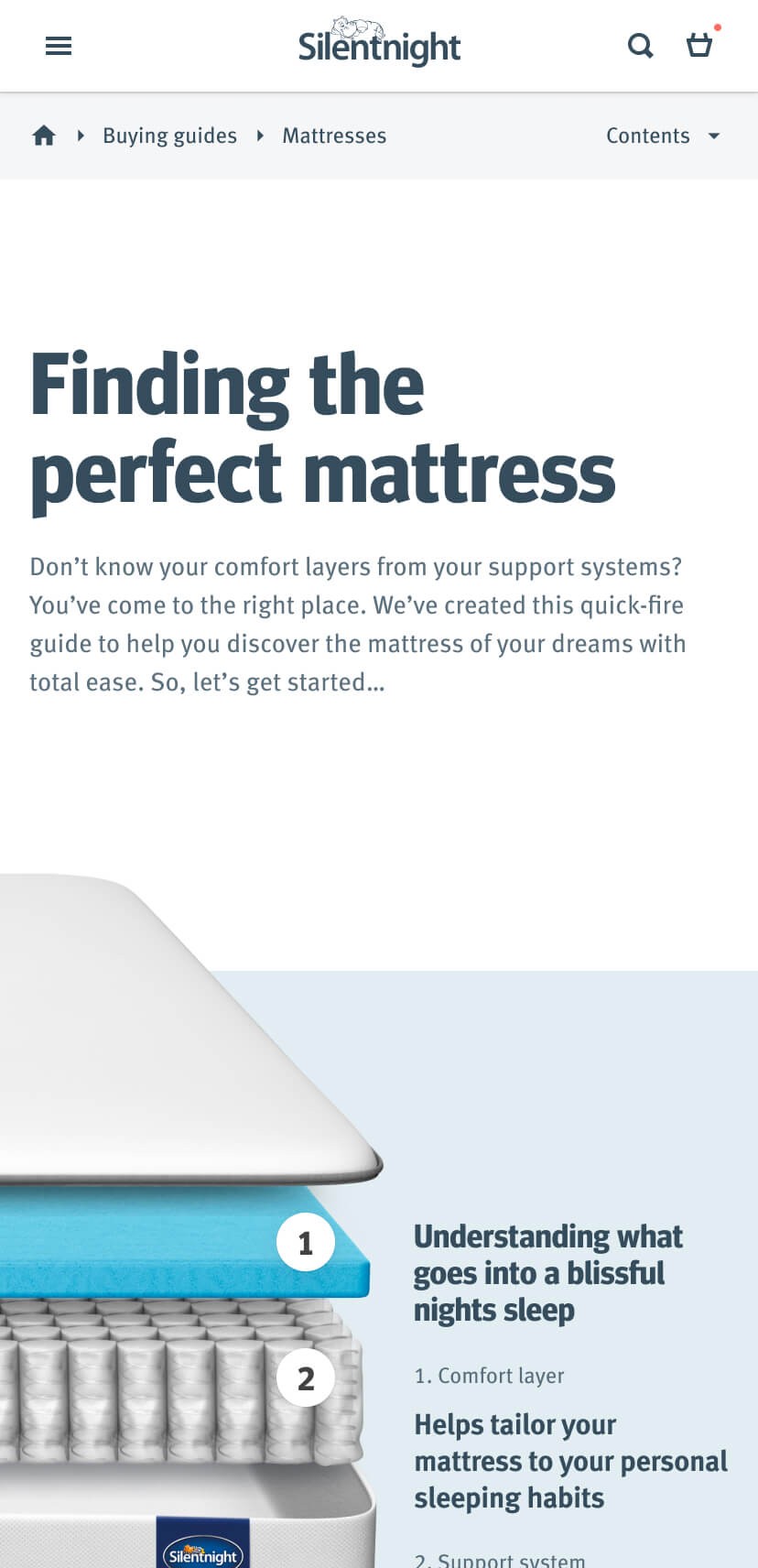
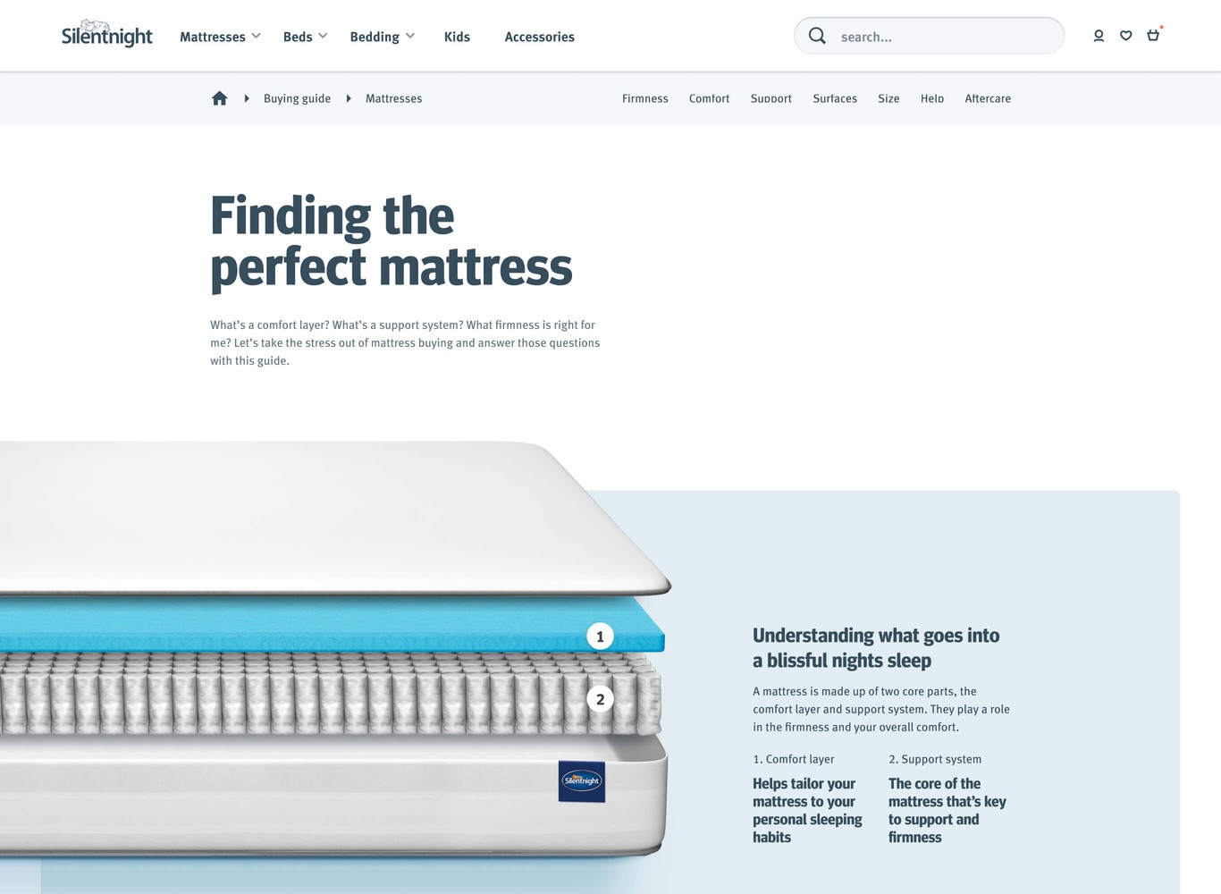
However, with some pages necessary from a search perspective. I saw this as an opportunity to be able to allow the research and advice seeking customers to drill down into the guidance they need. For example a high level page such as mattresses could lead you into a more detailed page at the relevant point. This would allow customers to drill down and research a topic such as ‘support systems’ in depth.
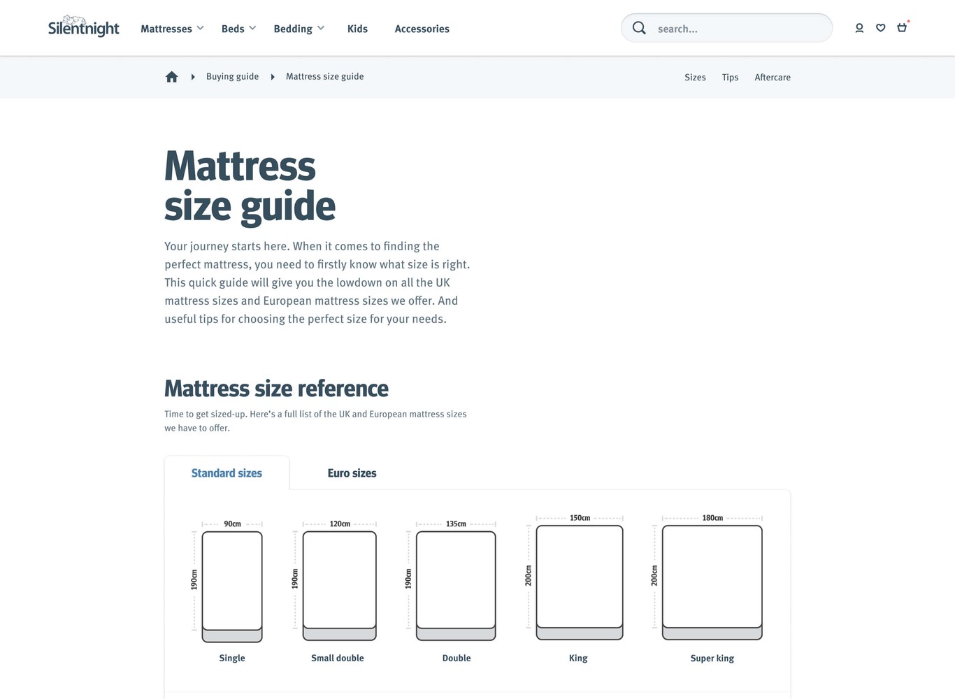
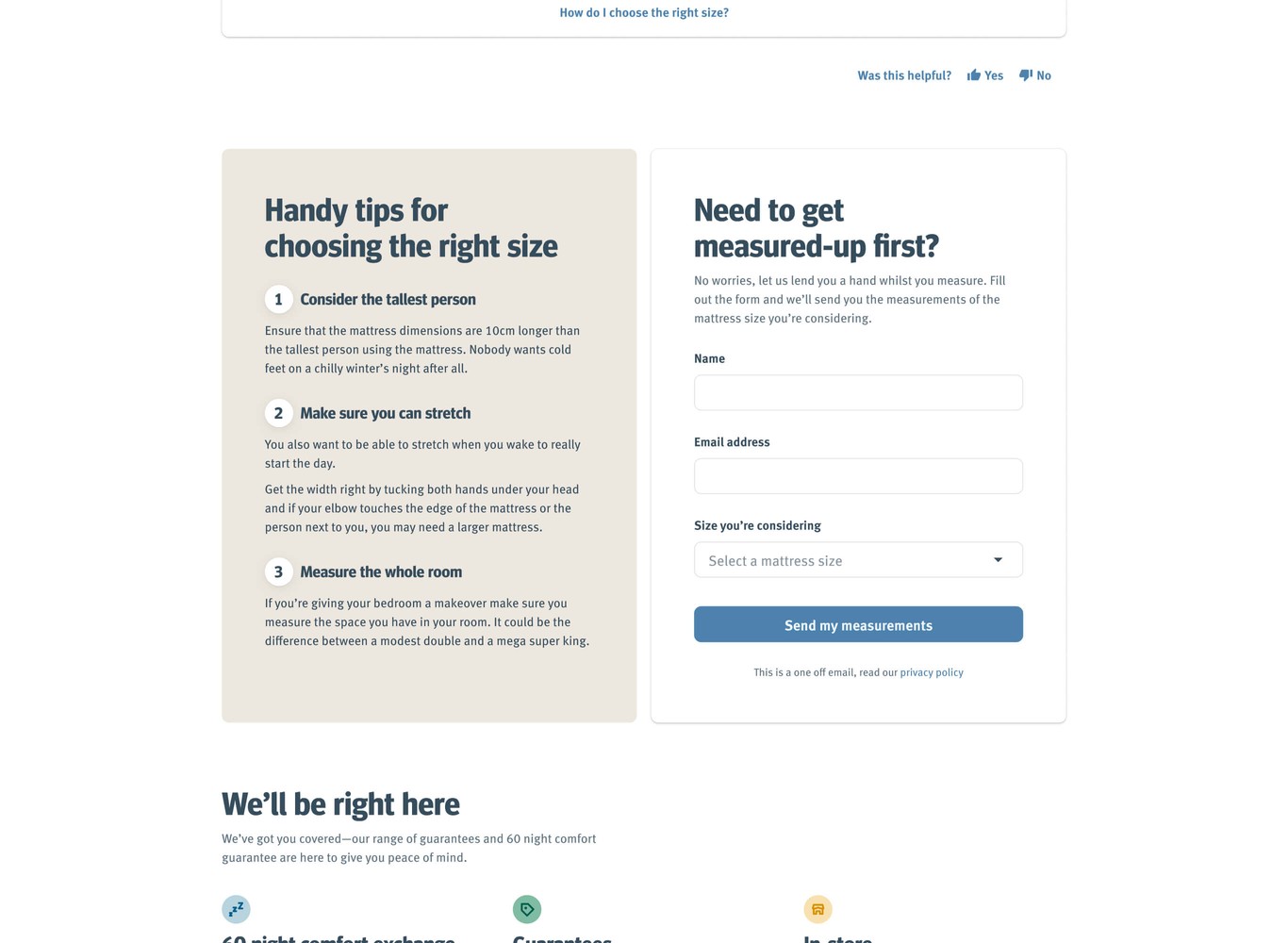
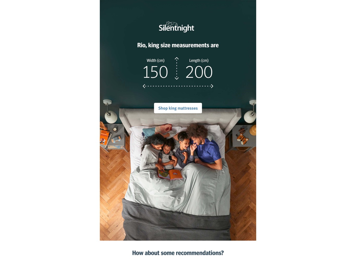
The mattress size guide is one of the most popular pages from a search perspective. It’s easy to understand way—this is a common customer question. Offering to email customers the measurements of their desired mattress was a simple way to drive return visits.
There was a lot of opportunity here to start a larger project around the advice provided throughout the website.
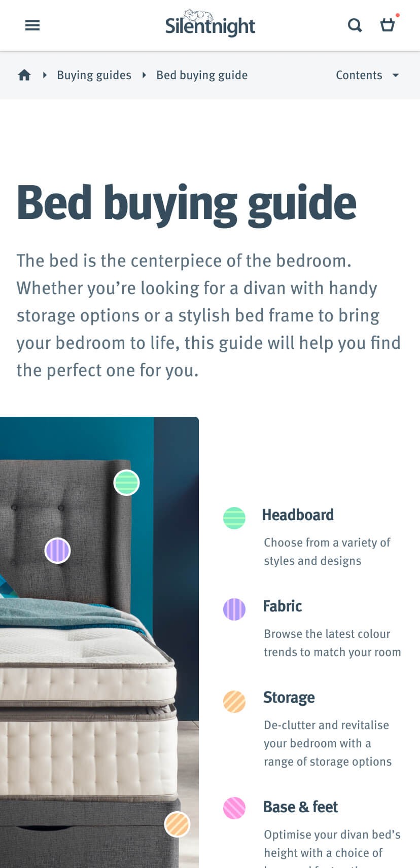
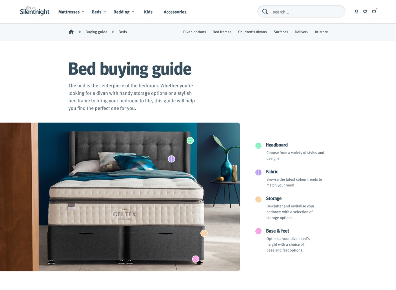
Broad categories allow for better discovery
In another regard relating to jargon, a portion of the guides were focused on these technical terms. If a customer is unfamiliar with a set of terms, how do they know they are directly related to mattresses, beds or bedding?
I also believed that one ‘monolithic’ guide per broad category would be more effective than smaller individual guides in making terminology accessible to customers.
Better reading experience combined with more engaging content
Due to the lack of focus on creating a nice reading experience, customers could be put off. Nobody wants to be faced with a wall of text—the visual design and readability are important.
Creating a reading experience that encourages you to explore and read the guides is important. Curating the content in such a way and allowing the user to get more information if they desire.
Work with core product ranges first
With all this in mind, the general approach was to focus core product ranges (mattresses, beds and bedding) in a concise and approachable way to get learnings as quickly as possible.
Addressing technical jargon
As mentioned earlier, as a team we heard frequently that customers found technical language challenging.
It meant that the guides were lacking crucial information that helps the researcher build confidence. However, it has its place at the right time as a customer builds their understanding.
Results
Overall I’m pleased with the guides, they have improved the information available to customers.
They brought together some of the more fragmented guides and made them more accessible than before, which helped to achieve a reduction in bounce and exit rate.
Bounce rate
Reduced from 54.51% to 36.31%
Exit rate
Reduced from 40.84% to 25.84%
Customer feedback after launch
One of our goals as a UX team at Silentnight was to improve customer satisfaction. We were able to gather feedback showing the information helps in the decision making process.
5/5
“The level of details of the explanations of the different layers of a mattress”
5/5
“Easy to find the right product and easy to understand the information.”
5/5
“Useful explanations re type of sleeper to help choose.”
4/5
“You can buy based on how you sleep”
Plenty of room for improvement
As part of an iterative process there’s plenty of room for improvement here. I’d have liked to continue learning what helps customers make the right decisions along with:
- Refine content further, there’s now a help & advice section
- Expand guides out to children, divans and bed frames
- Include more interactivity around firmness ratings
- Focus more on the style aspect of divans and allow customers to see fabrics clearer
- As bedding is less of a considered purchase would more recommendation than advice be better?